Dive into the vibrant world of color wheel creative ideas! In this comprehensive guide, we’ll explore the principles of color harmony, typography basics, composition techniques, and design principles. Get ready to unlock your creativity and elevate your designs with the power of color.
From understanding the psychological effects of different colors to mastering color mixing and theory, this guide will equip you with the knowledge and inspiration to create visually stunning and emotionally impactful designs.
Color Wheel Harmony
Color wheel harmony is a fundamental principle in design that involves the use of colors that are pleasing to the eye and create a sense of balance and unity. The color wheel is a circular diagram that displays the relationships between colors, and it can be used to create various color schemes.
There are several types of color wheel harmonies, each with its own unique effect. Some of the most common harmonies include:
Complementary Harmony
Complementary colors are colors that are opposite each other on the color wheel, such as red and green, blue and orange, or purple and yellow. When used together, complementary colors create a high contrast effect that can be visually striking.
However, it is important to use complementary colors in moderation, as too much contrast can be overwhelming.
Analogous Harmony
Analogous colors are colors that are adjacent to each other on the color wheel, such as red, red-orange, and orange, or blue, blue-green, and green. Analogous colors create a harmonious and cohesive effect, as they share similar undertones. They can be used to create a sense of unity and flow in a design.
Triadic Harmony
Triadic colors are colors that are evenly spaced around the color wheel, such as red, yellow, and blue, or green, orange, and purple. Triadic colors create a vibrant and dynamic effect, as they offer a wide range of contrast and variety.
However, it is important to use triadic colors carefully, as too much contrast can be chaotic.
Monochromatic Harmony
Monochromatic colors are shades of the same color, such as light blue, dark blue, and navy blue. Monochromatic color schemes create a sense of simplicity and sophistication, and they can be used to create a variety of effects, from calming and serene to bold and dramatic.
Color Psychology
Colors have a profound impact on our emotions, thoughts, and behaviors. Understanding color psychology can help you effectively communicate messages, create engaging designs, and make informed decisions in marketing, branding, and design.
Associations and Effects
Different colors evoke distinct psychological associations:
Red:Passion, excitement, danger
Orange:Optimism, warmth, creativity
Yellow:Happiness, positivity, caution
Green:Nature, growth, balance
Blue:Trust, stability, tranquility
Purple:Luxury, spirituality, creativity
Pink:Femininity, love, gentleness
Black:Power, sophistication, mystery
White:Purity, cleanliness, simplicity
Color Theory in Art
Color theory has played a pivotal role in the evolution of art throughout history. From the vibrant hues of ancient Greek temples to the Impressionist’s exploration of light and color, the use of color has profoundly influenced the way artists express themselves and convey emotions.
History of Color Theory
The origins of color theory can be traced back to ancient Greece, where philosophers like Plato and Aristotle theorized about the nature of color and its relationship to light. During the Renaissance, artists such as Leonardo da Vinci and Michelangelo experimented with color to create realistic and emotionally resonant works.
The Impressionists, in the 19th century, pushed the boundaries of color theory further, using vibrant and contrasting colors to capture the fleeting effects of light.
Key Artists and Movements
Throughout history, numerous artists and movements have made significant contributions to the development of color theory. The Renaissance masters, such as Titian and Raphael, used color to create a sense of depth and realism. The Impressionists, led by Monet and Renoir, explored the effects of light on color and developed new techniques for capturing the play of light and shadow.
Modernist artists, such as Matisse and Kandinsky, experimented with abstract color and form, using color to convey emotions and ideas.
Use of Color in Art
Color is a powerful tool that artists use to convey emotions, create visual effects, and establish symbolism. Warm colors, such as red and orange, can evoke feelings of excitement and passion, while cool colors, such as blue and green, can create a sense of calm and tranquility.
Artists also use color to create contrast, draw attention to certain elements of a composition, and establish a sense of depth and perspective.
Color in Photography
Color is a powerful tool that can be used to enhance and convey emotion in photography. By understanding the principles of color theory, photographers can use color to create images that are both visually appealing and emotionally resonant.
Using Color Creatively in Photography
There are many ways to use color creatively in photography. Here are a few tips:
Use complementary colors.Complementary colors are colors that are opposite each other on the color wheel. When placed next to each other, they create a striking contrast that can be used to draw attention to a subject or create a sense of excitement.
Use analogous colors.Analogous colors are colors that are adjacent to each other on the color wheel. They create a more subtle and harmonious effect than complementary colors, and can be used to create a sense of unity or balance.
Use warm and cool colors.Warm colors (red, orange, and yellow) are associated with energy, passion, and excitement. Cool colors (blue, green, and purple) are associated with calmness, serenity, and peace.
Use color to create a mood.The colors you choose can have a significant impact on the mood of your photograph. For example, using warm colors can create a sense of warmth and intimacy, while using cool colors can create a sense of detachment or isolation.
Use color to tell a story.Color can be used to tell a story or convey a message. For example, using a red filter can create a sense of danger or urgency, while using a blue filter can create a sense of calm or tranquility.
Color in Web Design
Color plays a pivotal role in web design, significantly impacting user experience and engagement. Choosing and using colors effectively can enhance website aesthetics, convey brand identity, guide user navigation, and influence conversions.
Guidelines for Color Selection and Use
When selecting colors for a website, consider the following guidelines:
Understand Color Theory:Familiarize yourself with color harmony, contrast, and psychology to make informed color choices.
Consider Brand Identity:Choose colors that align with the brand’s image and values.
Target Audience:Research the preferences and cultural associations of your target audience to select appropriate colors.
Accessibility:Ensure colors are accessible to users with visual impairments by providing sufficient contrast and avoiding color combinations that can cause difficulty in readability.
Consistency:Maintain color consistency throughout the website to create a cohesive and professional appearance.
Table: Color Theory and Web Design Application
Color Theory Concept
Web Design Application
Color Harmony: Analogous, complementary, triadic
Creating visually pleasing color combinations
Color Contrast: Lightness, saturation, hue
Improving readability and visual hierarchy
Color Psychology: Warm, cool, neutral
Eliciting desired emotions and conveying specific messages
Examples of Effective Color Use in Web Design
Here are some examples of websites that effectively use color:
Airbnb:Vibrant and warm colors create a welcoming and inviting atmosphere.
Dropbox:Simple and elegant blue tones convey professionalism and trust.
Spotify:Bold and contrasting colors enhance user navigation and highlight key features.
Color Palettes
Color palettes are a curated collection of colors that work well together. They can be used to create a cohesive and visually appealing design. There are many different ways to create a color palette, but some common methods include:
Using a color wheel:A color wheel is a circular diagram that shows the relationships between different colors. You can use a color wheel to create a palette by selecting colors that are adjacent to each other, complementary to each other, or analogous to each other.
Using existing color schemes:There are many existing color schemes that you can use as inspiration for your own palette. These schemes can be found in nature, in art, or in design. For example, you could use a color palette inspired by the colors of a sunset, a painting, or a website.
Using online tools:There are many online tools that can help you create a color palette. These tools typically allow you to select colors from a color wheel or from a library of existing palettes.
Once you have created a color palette, you can use it to create a variety of creative projects, such as:
Websites:Color palettes can be used to create a cohesive and visually appealing website. You can use your palette to select the colors for your website’s background, text, and graphics.
Logos:Color palettes can be used to create a memorable and recognizable logo. You can use your palette to select the colors for your logo’s icon, text, and background.
Presentations:Color palettes can be used to create a visually appealing presentation. You can use your palette to select the colors for your presentation’s slides, text, and graphics.
Here are some resources and tools for finding and generating color palettes:
Adobe Color:Adobe Color is a free online tool that allows you to create and share color palettes.
Coolors:Coolors is a free online tool that allows you to generate and explore color palettes.
Color Hunt:Color Hunt is a website that showcases a curated collection of color palettes.
Dribbble:Dribbble is a website that showcases a collection of design work, including color palettes.
Color Trends
Color trends are constantly evolving, reflecting the changing cultural, social, economic, and environmental landscape. These trends influence a wide range of industries, from fashion and interior design to graphic design and home décor. Understanding color trends is essential for creative professionals who want to stay ahead of the curve and create designs that resonate with their target audience.
Factors Influencing Color Trends
Numerous factors contribute to the emergence and evolution of color trends. These include:
Cultural influences: Colors have different meanings and associations in different cultures. For example, the color red is associated with good luck in China but with danger in many Western cultures.
Social influences: Social movements and events can influence color trends. For example, the rise of the environmental movement has led to an increased popularity of green and other natural colors.
Economic influences: Economic conditions can affect the availability and affordability of certain colors. For example, during economic downturns, people may be more likely to choose less expensive colors.
Environmental influences: Environmental concerns can also influence color trends. For example, the growing awareness of climate change has led to an increased demand for sustainable colors.
Color Combinations: Color Wheel Creative Ideas
Understanding color combinations is crucial in design. Different combinations evoke distinct emotions and convey specific messages. This guide explores various color combinations and their potential applications.
Complementary Colors
Complementary colors are located opposite each other on the color wheel. When placed side by side, they create a striking contrast and high visual impact. Examples include blue and orange, red and green, and purple and yellow.
Uses:Attention-grabbing headlines, bold logos, and dynamic packaging.
Effect:Energizing, exciting, and attention-grabbing.
Analogous Colors
Analogous colors are adjacent to each other on the color wheel. They share a common hue and create a harmonious and cohesive look. Examples include blue, blue-green, and green.
Uses:Calming interiors, soothing websites, and elegant branding.
Effect:Serene, balanced, and sophisticated.
Triadic Colors
Triadic colors form an equilateral triangle on the color wheel. They offer a vibrant and balanced combination. Examples include red, yellow, and blue.
Uses:Eye-catching posters, dynamic artwork, and engaging presentations.
Effect:Stimulating, vibrant, and attention-grabbing.
Monochromatic Colors
Monochromatic colors are shades of the same hue. They create a sophisticated and elegant look. Examples include light blue, navy blue, and royal blue.
Uses:Minimalist designs, luxury branding, and calming spaces.
Effect:Subtle, sophisticated, and timeless.
Color Schemes
Color schemes are sets of colors that are used together to create a cohesive and visually appealing design. They can be used in a variety of applications, including web design, graphic design, and interior design.
There are many different types of color schemes, each with its own unique look and feel. Some of the most popular color schemes include:
Monochromatic: A monochromatic color scheme uses different shades and tints of a single color.
Analogous: An analogous color scheme uses colors that are adjacent to each other on the color wheel.
Complementary: A complementary color scheme uses colors that are opposite each other on the color wheel.
Triadic: A triadic color scheme uses three colors that are evenly spaced around the color wheel.
Tetradic: A tetradic color scheme uses four colors that form a rectangle on the color wheel.
When choosing a color scheme, it is important to consider the overall mood and tone that you want to create. For example, a monochromatic color scheme can create a sense of calm and serenity, while a complementary color scheme can create a sense of excitement and energy.
Color schemes can be used to create a variety of different effects. For example, they can be used to:
Create a sense of unity and cohesion
Highlight important elements
Create a sense of depth and dimension
Convey a specific mood or emotion
Color schemes are an essential tool for any designer. By understanding how to use them effectively, you can create designs that are both visually appealing and effective.
Color and Culture
Colors carry profound cultural significance and symbolism, varying widely across the globe. They are deeply intertwined with emotions, values, beliefs, rituals, and festivals, shaping how we perceive and interact with the world around us.
Cultural Associations of Colors
Colors evoke distinct emotions and associations in different cultures. For instance, red may symbolize love and passion in Western cultures, while in China, it represents luck and prosperity. Similarly, white may denote purity and innocence in many societies, but in some African cultures, it is associated with mourning.
Colors in Rituals and Festivals
Colors play a vital role in rituals and festivals worldwide. In Hindu festivals, vibrant colors like red, yellow, and orange are used to create a festive atmosphere and invoke divine blessings. In traditional Chinese weddings, the color red is prominent, symbolizing joy, prosperity, and good fortune.
Cultural Variations in Color Meanings
The meaning of colors can vary significantly across cultures. For example, the color blue is often associated with tranquility and calmness in Western cultures, but in some Asian cultures, it can symbolize mourning or sadness. Understanding these cultural differences is crucial for effective communication and design.
Color in Nature
Nature is a vibrant canvas adorned with an endless array of colors, each playing a crucial role in the environment. From the verdant greens of chlorophyll-rich plants to the iridescent wings of butterflies, nature’s color patterns inspire awe and creativity.
Observing and Imitating Natural Color Patterns
Observing nature’s color combinations can spark imaginative ideas. Artists and designers have long drawn inspiration from the harmonious hues found in natural landscapes, floral arrangements, and animal life. By imitating these patterns, we can create visually appealing works of art and design that resonate with the beauty of the natural world.
* Claude Monet:His Impressionist paintings captured the fleeting light and colors of nature.
Georgia O’Keeffe
Her floral paintings showcased the vibrant hues and intricate patterns of flowers.
Henri Matisse
His bold use of color was inspired by the bright colors of the Mediterranean landscape.
Capturing and Reproducing Natural Colors
* Photography:Use natural light and white balance to accurately capture natural colors.
Painting
Study the colors of nature and mix paints to create realistic representations.
Digital Art
Utilize color palettes and software tools to replicate the hues and tones found in nature.
Color and Emotion
Color is a powerful tool that can be used to evoke emotions and create a desired response. Different colors have different emotional associations, and understanding these associations can help you use color effectively in your designs and marketing efforts.
For example, red is often associated with passion, excitement, and energy. It can be used to create a sense of urgency or to draw attention to something important. Blue, on the other hand, is often associated with calmness, serenity, and trust.
It can be used to create a sense of peace or to promote relaxation.
By understanding the emotional associations of different colors, you can use them to your advantage in your designs and marketing efforts. For example, if you want to create a sense of urgency or excitement, you might use red. If you want to create a sense of peace or relaxation, you might use blue.
Color Mixing and Theory
Understanding color mixing is essential for artists, designers, and anyone working with colors. It allows you to create a wide range of shades and hues, and to achieve specific visual effects.
Primary and Secondary Colors
The primary colors are red, yellow, and blue. These colors cannot be created by mixing other colors. Secondary colors are created by mixing two primary colors. For example, mixing red and yellow creates orange, mixing red and blue creates purple, and mixing yellow and blue creates green.
Tertiary Colors
Tertiary colors are created by mixing a primary color with a secondary color. For example, mixing red and orange creates red-orange, mixing yellow and green creates yellow-green, and mixing blue and purple creates blue-purple.
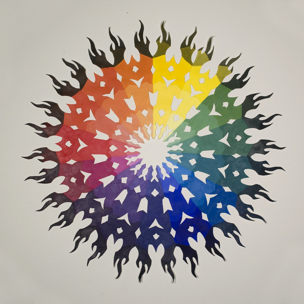
Color Wheel
The color wheel is a circular diagram that shows the relationships between colors. It is divided into 12 sections, with the primary colors at the top, the secondary colors in the middle, and the tertiary colors at the bottom.
Looking for creative ways to use the color wheel? Check out these creativos for inspiration. They’ve got tons of ideas for using color theory to create stunning designs. And once you’ve mastered the basics, you can start experimenting with your own color wheel creative ideas.
Color Mixing Techniques, Color wheel creative ideas
There are two main color mixing techniques: subtractive and additive.
Subtractive Color Mixing
Subtractive color mixing is used in traditional painting and printing. In this method, colors are mixed by adding pigments to a white surface. The more pigment that is added, the darker the color becomes. The three primary colors in subtractive color mixing are cyan, magenta, and yellow.
Additive Color Mixing
Additive color mixing is used in digital displays and lighting. In this method, colors are mixed by adding light of different wavelengths. The more light that is added, the brighter the color becomes. The three primary colors in additive color mixing are red, green, and blue.
Color in Typography
Color plays a significant role in typography, impacting readability, visual appeal, and overall message delivery. It can enhance the visual hierarchy, draw attention to specific elements, and evoke emotions.
By carefully selecting colors and considering their impact, designers can create typographic designs that are both visually appealing and effective in communicating their intended message.
Color Contrast
Color contrast refers to the difference in lightness or darkness between two colors.
High contrast makes text easier to read, especially for individuals with low vision or color blindness.
Consider using a light background with dark text or vice versa for optimal readability.
Color Harmony
Color harmony is the pleasing combination of colors that creates a visually balanced and cohesive design.
Analogous colors (adjacent on the color wheel) create a harmonious effect.
Complementary colors (opposite on the color wheel) can create a striking contrast but should be used carefully to avoid overwhelming the design.
Emotional Impact
Colors evoke different emotions and associations.
For example, red is often associated with passion, excitement, and danger, while blue conveys calmness, trust, and stability.
Consider the emotional message you want to convey and choose colors accordingly.
Color in Packaging
Color is a crucial element in packaging design, profoundly influencing consumer behavior and brand perception. It serves as a non-verbal cue, conveying vital information about the product and the brand it represents. Effective use of color can differentiate products, enhance brand recognition, and drive consumer engagement.
Cultural and Psychological Associations of Colors
Colors evoke distinct cultural and psychological associations. For instance, red often signifies passion, excitement, and urgency, while blue conveys trust, stability, and tranquility. Understanding these associations enables designers to leverage color to resonate with target audiences on a deeper level.
Case Studies of Successful Packaging Designs
Coca-Cola:The iconic red and white packaging of Coca-Cola has become synonymous with the brand, creating instant recognition and establishing a strong brand identity.
Apple:Apple’s minimalist packaging, often featuring white or silver hues, exudes a sense of elegance, simplicity, and premium quality.
Tiffany & Co.:The signature robin’s egg blue packaging of Tiffany & Co. evokes luxury, sophistication, and exclusivity.
Step-by-Step Guide to Choosing Colors for Packaging
Target Audience:Consider the demographics, preferences, and cultural background of the target audience to choose colors that resonate with them.
Product Type:Different product categories have certain color associations. For example, blue is often used for water-based products, while green is associated with organic or natural products.
Brand Positioning:The colors chosen should align with the brand’s positioning and desired image. For instance, a brand aiming for a playful and energetic image might use bright and vibrant colors.
Table: Key Principles of Color Theory in Packaging Design
Concept
Description
Color Schemes
Combinations of colors that create a harmonious and visually appealing effect.
Complementary Colors
Colors that are opposite each other on the color wheel, creating a high-contrast and attention-grabbing effect.
Color Psychology
The study of how colors influence human emotions and behavior, informing color choices based on desired responses.
What are the basic principles of color wheel harmony?
Color wheel harmony refers to the pleasing combinations of colors that can be found on the color wheel. These harmonies include complementary, analogous, triadic, and monochromatic schemes, each creating a unique visual effect.
How can I use color psychology in my designs?
Color psychology explores the emotional associations and cultural meanings of different colors. Understanding these associations can help you use colors strategically to evoke specific emotions, convey messages, and create desired atmospheres in your designs.
What are some tips for using color creatively in photography?
In photography, color can be a powerful tool for storytelling and emotional expression. Experiment with color filters, white balance adjustments, and post-processing techniques to enhance the mood and impact of your images.